Categories
All About Process Art & Illustration

Comic Book Jazz Hands: BETA RAY BILL

George O’Connor and I have used BETA RAY BILL as an excuse to collaborate once again! This time I pencilled, he inked, then I hand colored this here horse faced warrior (take a quick peek at our previous attempt, which reversed our tasks). We slapped a logo on top of it in order to fit the “What If” Blog format (formerly known as the DC Fifty TOO blog which features a lot of my favorite cartoonists, I’m not joking.)

Big thanks to Jonathan Morris for putting this together and for the invite. I dare not forget the amazing Sarah Crowe, who helped George and I out on the technical (and spiritual) side of things.

Beta Ray Bill was created and designed by Walter Simonson (Thor #337, Nov. 1983) and is property of Marvel Comics Group Entertainment Disney.

Check out the step by step…

Categories
Art & Illustration Sometimes I Like Stuff

I Still Believe (Daredevil #260)

I recently did this drawing for Bergen Street Comics, my very own Daredevil cover on one of the blank “sketch” covers. I noticed that the back portion was available, so I designed it vertically, knowing that what I wanted to draw wouldn’t necessarily work if the comic was one/half displayed.

You may ask, “Well, how come you didn’t have him striking a pose mid-jump through a couple of water towers or fighting a cluster of ninjas?”, and you may very well have a point. Although I’ve seen those classic scenarios done to death, I still like them just as much as you do. However, no version of Daredevil is as close to my heart as Ann Nocenti’s version.

Categories
Art & Illustration Music Is Involved

FLYER ART: A Collection

An old friend of mine, Erik Mallo, is currently looking to recruit musicians for his original recordings. I was more than happy to tread some familiar ground by making a flyer for his endeavor. I like his music a whole lot, so it was my pleasure to assist him in any way I could.

Click on the image below to read the fine print & feel free to pass it around to other musicians.

Since I haven’t done a flyer in many years, I thought it’d be interesting to pull out some of my older ones. Whether it was for the Knitting Factory or for a pal’s band, drawing flyers was a dominant preoccupation for me. With this new one complete and in looking back at those from long ago, I came to a few conclusions.

First, it’s easy to see that my approach was text-heavy. These things required tons of pertinent information and I also liked the idea of sneaking in mild jabs at the bands and in jokes along the borders. I imagined someone taking a flyer and needing to read something on the subway, so giving them their money’s worth was the way to go.

Secondly, I clearly had an aversion to color. I was resigned to being a strict black & white artist. I didn’t think color would save these pages from looking bland, muddled, or incomprehensible. I certainly didn’t think it hindered me as an artist. I was reacting to what I saw everywhere, the carnival colored rock & roll imagery. I would see pieces by “poster” “kings” like Kozik or KayWolf and scoff at how bland it all was. Every flyer and poster I saw was either generic and boring or derivative and lacking any thematic reason to exist. I thought I was tapping into some new shit by cramming every page with stuff, daring you to take a second from your precious time to hold still and read a word or two.

Looking back, however, I would’ve handled things a little differently. I wouldn’t necessarily sacrifice information for design (even with today’s ultra accessibility), but I would definitely play a lot more with color and patterns. I would scrap the in jokes and focus on making a strong image, especially if the band was already well-known and the poster was just another piece of merch for them to sell. It’s interesting, though, that with this new flyer I tried to make a solid design while incorporating ALL of the information that was given to me (which was of upmost importance). I added no cutesy details and tried to compress the lettering wherever I could. I’m happy with the way it turned out.

Now here’s the old stuff in chronological order, from 2001-2005…

Categories
Art & Illustration Sometimes I Like Stuff

AKIRA Summer Fun

The little kid is Akira. That guy behind him is Joker. They’re both characters from Katsuhiro Otomo’s AKIRA.

Categories
"ZEGAS" Art & Illustration

Zegas Commissions & the Black Terror

These here pieces are a few recent commissions I did of my Zegas characters, Emily & Boston. It’s weird drawing commissions because there’s little room for mistakes. Zero room, actually, and so I was super careful in the inking and hand coloring. Considering how messy I can be sometimes, I’m proud at how clean they turned out!

On the flip side, I’ve been toying around with digital coloring these past few weeks, and who better to practice on than the Black Terror? You may have seen this guy around, he’s one of those public domain Golden Age properties. It’s basically the Punisher with a cape… how could I not draw that? The drawing itself is in ink and his gray/yellow suit is hand colored, the rest is digital. Although it looks like the simplest, most rudimentary set of choices, what you see here is me trying to figure this whole coloring thing out.

It was fun, but I don’t know if I’d like to do an entire comic like that. It would take forever. For now, I’ll try to stick to what I know.

Categories
Art & Illustration Comics I Make

Goodbye, 2010, It Was Grand

Before I close out and lock up the 2010 Art File for good, I thought I’d post a few random odds and ends that never really found a specific home anywhere. Hopefully, they’ll now have a place to rest within your hearts.

I didn’t do to many X-mas cards this year, but I like this one the most.

“SEQUOYAH” is a work-in-progress. It’s written by Nick Bertozzi. We have tons of ideas for these characters. I can’t wait to draw more raccoons.

Categories
Art & Illustration Dear Friends

Warm Ups & Top 5 Villains

Recently, we all celebrated George O’Connor’s birthday by fooling him into thinking the topic of the day was “unicorns”, while actually drawing something more directly related to him. I opted for his favorite Olympian god Hermes!

Earlier in the week, Drawbridge came up with J.M. DeMatteis Day, in which we all depicted some of our favorite DeMatteis characters. I drew J’onn J’onzz, the Martian Manhunter in his natural state, inspired by the mini series of the same name that J.M. did with Mark Badger for DC Comics. Whatever results from their fantastic collaborations, it comes highly recommended (see Gargoyle and Greenberg the Vampire). I also threw in some Oreos (J’onzz’ favorite) as a tip o’ the hat to DeMatteis’ run on Justice League, and some Dostoevsky (one of J.M.’s favorite). Huzzah!

Also, we all drew characters from the comic, LOVIATHAN, in celebration of its creator Mike Cavallaro’s birthday. I drew Queen Aine, who has a head piece that rivals Jack Kirby’s Maximus the Mad.

On an unrelated note, a couple of weeks ago, The Comics Reporter had their weekly “Five for Friday” ask their readers to “Name Five Members Of A Rogues Gallery NOT Batman’s, Dick Tracy’s Or Spider-Man’s And Don’t Identify The Hero.” I submitted my Top 5 villains as:

1) Ammo
2) Bullet
3) Bushwacker
4) Wildboys
5) Typhoid Mary

In closing, I’d like to show you my drawing of those villains, a sort of warm up sketch I did before that list was asked for. It was meant to be!

But enough warming up. It’s time to go to work.

Categories
All About Process Art & Illustration

I’m Running My Inkpen

I was talking about comic book inkers with George O’Connor a couple of weeks ago and during our conversation, I realized that I’ve never inked anyone before. I’ve never been inked either, which is fine because I wouldn’t wish my sloppy pencil work on my worst enemy*. I’m still fascinated by the old school assembly line process, so George and I agreed to swap drawings for each to work on.

Categories
Art & Illustration

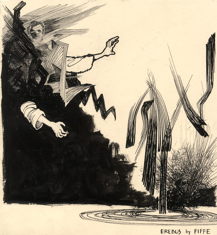
EREBUS

I recently drew Erebus, the god of darkness and shadow, for George O’Connor’s Olympians Rule! blog. Olympians is a 12 book series retelling the Greek Myths as only George O’Connor could. The first 2 volumes are out now (ZEUS and ATHENA), so get ’em if you don’t already have ’em… and keep checking in on their Official Site!

Also, feel free to stalk George through his art blog. He’s always posting cool rarities, sketches, and old school comics… it’s always a treat to read.

Categories
Art & Illustration Los Press

Birthdays, Reviews, Interviews and Tears of Joy

Remember the debut issue of the new literary magazine, Cousin Corinne’s REMINDER? Yeah, well, the comic section titled “Comix Block” has been recently reviewed by Jeffrey C. Burandt for Graphic NYC. It’s a great, insightful review that while praising the works within, also questions whether the comix section should really be clumped into a “block” or not.

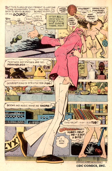
Plop

On a considerably different note, above is a great Alex Toth page that I’ve been looking at for years yet still haven’t come across the entire story. It’s from an issue of “PLOP”, I believe. How great would it be to have a collection of Toth stories from the 70s? He did some random and wild stuff in that era, and although it’s fun to hunt or discover back issues, longbox hopping isn’t conducive to introducing, nay, convincing readers that Toth was the best.

I recently listened to a Mark Chiarello interview over at Sidebar, and Mark recounts his relationship with Alex Toth. Thing is, Mark was trying to put together a Toth book but was always being met with resistance from DC (which led to his unfortunate but expected falling out with Toth). The overall interview is really good, but it kills me that a Toth book is an “almost-was” and not a staple in everybody’s library.