Category: Interviews I’ve Conducted
I sometimes interview cartoonists. This may sometimes overlap with a retrospective or a profile I’ve written, but the interviews are mostly in-depth enough to cover a lot of ground.
Tony Salmons Interview
I interviewed Tony Salmons over at The Factual Opinion (in three segments). Salmons talks about his comic art development, breaking in and staying afloat, and a brutal behind-the-scenes overview which spans several eras in corporate comics.
What Salmons has to say will strike many chords with working cartoonists, and it will definitely rub a few the wrong way. He’s up front about the reputation that supposedly precedes him and about his relationship with editorial, perhaps burning bridges that were never really there.
Getting a chance to feature Salmons like this was an opportunity of a lifetime, being a long time fan of his work and all, but also because there was little to nothing out there about the artist himself. It took us a few tries over a stretched out period of time to cover his career in detail, and I thank Tony for being so patient in my conducting this expansive and revealing, almost purgative, interview.
Aside from the interview, I followed up with two of collaborators from the past: Mark Chiarello and Martha Thomases.
Martha Thomases and Tony Salmons worked on the sharp and short lived Marvel series, Dakota North.
Martha Thomases on Dakota North’s development: “First of all, let me point out that this was about 25 years ago, and my memory is not what it used to be. If my version contradicts anyone else’s, please believe them. I had done some writing for Marvel’s humor magazine, which was edited by Larry Hama. He and I would discuss gender roles in pop culture. He had the idea at the time, which I think is genius, that Wonder Woman should be written like Charlie’s Angels, and would then attract a huge audience. Through these conversations, we developed the idea for Dakota North. Larry brought Tony in. He was living in Connecticut at the time, and we’d meet occasionally in Larry’s office. Because I was new to script-writing, most of my collaboration was with Larry. I’d write something, he’d explain how it wasn’t useful for the artist, and I’d re-write. And re-write. And re-write. For someone who has read comics since I was five years old, I was extremely stupid about telling a story visually.”
On working with Salmons and further stories: “I based a few of the characters, visually, on friends of mine. Dakota was Norris Church Mailer. Another character was my friend David Freelander, a fashion designer who died from AIDS a few years later. Tony never met them, and yet his drawings looked remarkably like them. It was supposed to be an on-going series. That said, I have no idea where I planned to take it. However, I do have a draft proposal for a mini-series, so I guess the characters have stayed with me.”
On cancellation: “I remember sitting in Larry’s office when Jim Shooter poked his head in to casually announce the cancellation, just after the third issue came out. I think it was because of poor sales. I know the first issue sold more than 120,000 copies, but I guess subsequent issues tanked.”
Mark Chiarello has worked with Salmons as his colorist on Vigilante: City Lights, Prairie Justice and as his editor on Batman: Black & White.
Mark Chiarello on coloring Tony’s unorthodox style: “Anytime you color artwork as inspired as Tony’s stuff is, you just get a little more jazzed than usual. You don’t do anything different per se, other than simply being a little more excited about the material you’re working on, which always makes for a better end product. I talked with the editor, Archie Goodwin, a bit about my approach but then just ran with it. As I recall, it wasn’t till after the series was printed that I called Tony to buy a few pages of the original art.”
On Salmons meeting deadlines: “Tony is pretty much the worst with deadlines, or at least he was on the few DC projects that we worked on together. The cause? Oh, I have my own theories, I’m sure it’s some deep seated fear of becoming too rich and too famous. Yup, [Vigilante] was that late. Bret [Blevins, fill in for the series] pretty much saved our asses on that one!”
On working with Tony as his editor: “Again, Tony lived up to his reputation as an astonishingly brilliant artist and a total flake. I’ve always thought of Tony’s work as a cross between a fine artist like Jeff Jones or Kent Williams and a totally dynamic, vibrant commercial artist like Jack Kirby. The pages were just a thing of beauty , but they were ridiculously late. [Batman: Black & White] was really the project that told me it’s probably better for me to be a fan of this guy’s work, rather than a business associate. Tony is an incredibly sweet guy, but sometimes it’s best to step back and just admire the talent from afar.”
– – – – – – –
Many thanks to Martha, Mark, and Tony for their time.
–Fiffe
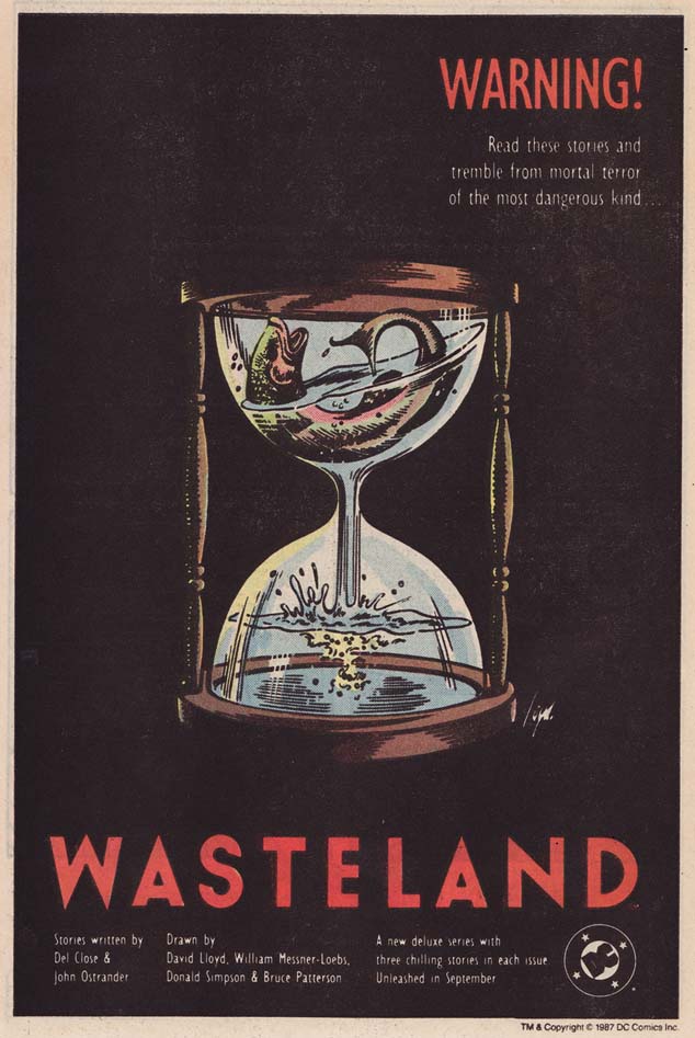
I interviewed writer John Ostrander for a piece on the dark humor anthology comic, Wasteland, over at The Factual Opinion. In the article, Ostrander talks about his involvement in the title, as well as his working relationship with Wasteland co-writer, the late Del Close. It’s a comic series I always return to, as it features the work of some of my favorite creators, but the most recent — and most important — detail I’ve discovered was how deeply connected Wasteland is to the art of Improv. That would make perfect sense to anyone familiar with the work of Del Close, but Ostrander shed some light on just how defined that writing dynamic was. Read the interview, then find out for yourselves how great these comics really are.
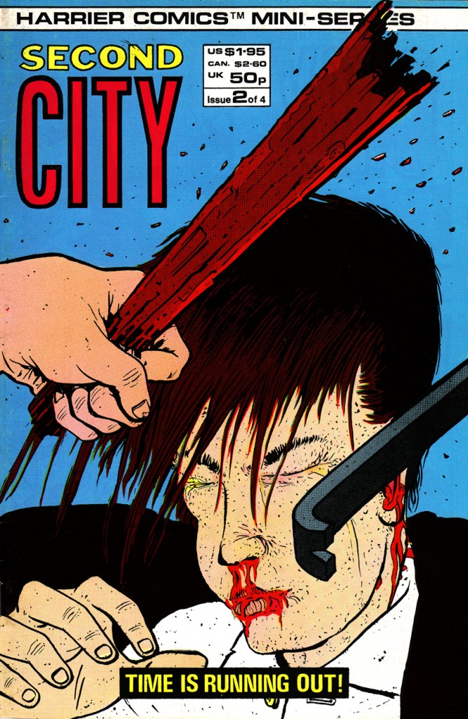
I had the pleasure of interviewing Paul Duncan and Phil Elliott, the creative team behind Second City, over at The Factual Opinion. They’re responsible for creating one of my recent favorite comics (back in ’86) for UK’s Harrier Comics. In the interview, they talk about their collaborative steps, thematic nuances, and the things that influenced this underrated, brilliant mini series.
Thriller is quite possibly one of the most underrated and forgotten gems from modern comics. It was a critical and commercial failure by the standards of the day, but it still holds up as a sharp and compelling comic book series. Robert Loren Fleming gave life to a great cast of odd and inviting characters without giving in to cliché and Trevor Von Eeden is the one who shaped the idea with a wildly imaginative vision. Perhaps what made Thriller unique is what killed it. How Thriller was ever released in the first place by DC Comics seems like a fluke, but the proof is in the short lived run: there was no comic out there like it and there never will be.
Long ago, there came the day when I stopped collecting comic books and started getting into music and girls. It’s a typical story that most boys go through, but it wasn’t that clean cut for me. Comic book reading was a difficult habit to break, and I wasn’t really getting into music anyway. A few friends of mine were eager for me to join them in whatever role they were adapting for themselves: “C’mon, are you a rocker or a hip-hopper?” However, When I first heard the Red Hot Chili Peppers’ “Mother’s Milk” album through a friend, the decision was made for me: I just liked them and that was it. I was hooked.

[Line-up for the first album: Sherman, Martinez, Kiedis, Flea.]
I recorded my friend’s “Mother’s Milk” CD onto a tape and played it over and over, day after day. The music sounded like nothing I had ever heard before and I immediately fell in love with those weird, infectious sounds. The band members were all these crazy looking, uninhibited beams of energy and sex and fun. I was 13 and these bare chested goofballs were my idols. I never owned any music prior to that ratty cassette, but that musical discovery led to an obsession. I eventually hunted their older albums down and absorbed them the way I did my already worn out tape. I was especially drawn to the the cover art to their self titled debut which was created by Gary Panter. I hadn’t drawn a single comic book image in months, but I suddenly found myself doodling his Chili Peppers characters all over my school books.

[In its full glory, from 1984.]
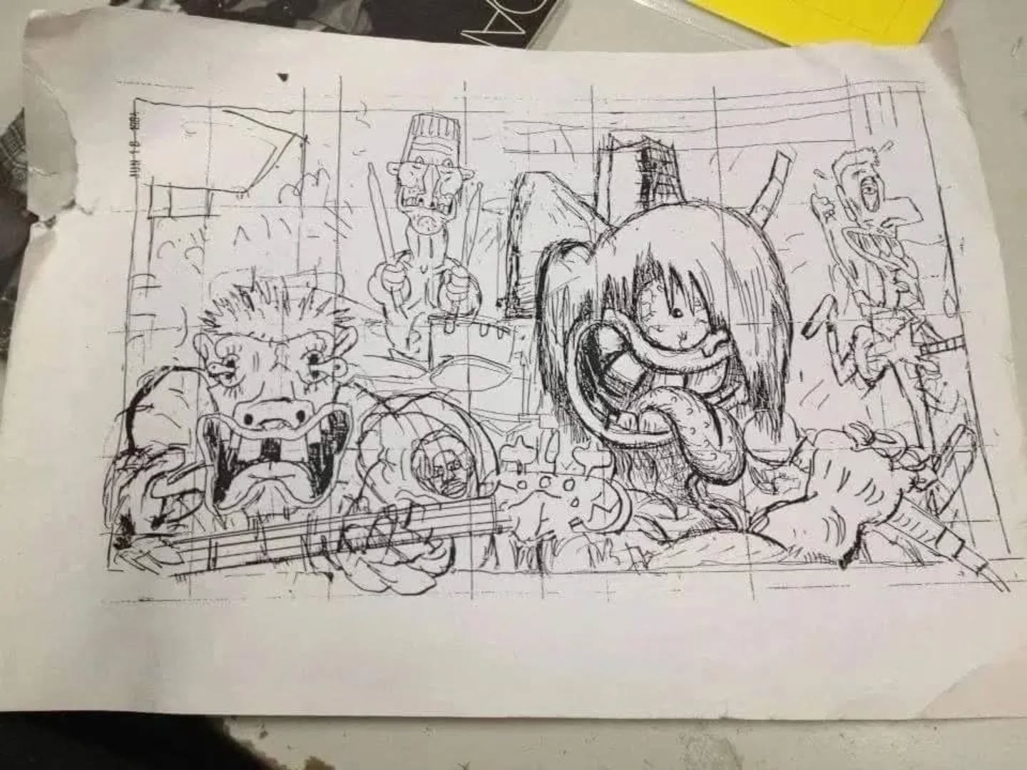
Never hesitant to seek and nerd out over the details of something like this, I asked Gary to shed some light on how he ended up working on that cover. He was kind and generous enough to divulge the details of his involvement:
“Eric Greenspan, who I had met when he bought a painting of mine from a show at Steve Samiof’s (editor of SLASH) SHOFA, on Larchmont Avenue in LA, was really into reggae music and rock. He managed Steel Pulse and later Ice-T and he was always avidly looking for new stuff. He kept telling me about a new band that performed naked and were great. I had heard of them and seen Flea at the premiere of Penelope Spheeris’ Suburbia. He started working with them and finally I went with Eric to see them and they were really great. They lived in my neighborhood and I saw them around at punk shows and stuff and on the street stopping traffic by walking into it. Not a great idea unless you really don’t care. They knew my work from SLASH; I knew the art director, Henry Marquez, socially, as I was schlepping my portfolio around and meeting people, and Eric was another connection. Can’t remember if Henry was art director for both records.”
My teenage brain couldn’t even register how this cover was made, let alone thought up, and even when Gary explains it… it still can’t.
“I made it kind of like the paintings I was doing then, which was a series of thinned acrylic paintings on heavy paper that suggested bad print jobs I saw on the border of Mexico when I was a kid. And bad American print jobs, like the printing on Popcycle wrappers. I went to a rehearsal, which was terrific, and drew them and tried to figure out cartoonish versions of them that alluded to Weirdo plastic kits by Roth and Mouse which to me were powerful styles. Being the only audience for a Chili Pepper rehearsal was swell, especially because they tried stuff in rehearsal that they would never do on stage (which was true of other bands I watched and drew in rehearsal, like the Weirdos and the Screamers), like playing stuff too fast or too slow and doing inside joke chants and stuff.”

[Reunited for their 3rd release, original band line up included Hillel Slovak & Jack Irons, 1987.]
Gary also did the cover art for their third album “Uplift Mofo Party Plan” (above) which quickly became my favorite Chili Peppers album upon listening to it. The cover art (mostly covered up by a big picture of the band) is totally different from the first one yet still captures the spirit of the band. Was it mere coincidence that their sensibilities meshed so well?
“I knew them a little better then and they told me things that they wanted on the cover, which were images from songs and also the big car that they had pimped out with fake fur, toys, flashing lights, etc. They took me out to the car on the lot of the record company and I made some notes and sketches. They were a big band by then, so I asked to do a gold foil or gold ink overlay of lines, which I drew separately from the painting. Bigger bands got bigger printing budgets.”
I recently came across a photo of the original album art for “Uplift…”, a 50-inch wide psychedelic gouache drawing on paper. Apparently there was a note on the bottom of the art board: Please Return Art to Gary Panter. It was auctioned off at Christie’s (est. $10,000 – $15,000) a couple of years ago.

“Well. I don’t remember if I gave it away, sold it, or left it so long in a friends garage that she finally had a garage sale. I did not get anything from that resale. The money part of art is generally an illusion. The making of the art and the meeting of people and seeing it float around the world are the neat part.”
The Red Hot Chili Peppers have been a huge institution in rock music for many years now, something far removed from their vibrantly rough identity of the 80s. I’m too emotionally invested in that material to hear them as anything but the greatest music ever; those early records still give me a thrill after all this time. I always found it funny that Gary Panter, an icon who I later discovered to be a critical figure in cartooning, was the artist who visually shaped the Chili Peppers in my mind’s eye during my no-comics-allowed days. These covers are mere pebbles in his expansive body of work, but they’ll always be prime examples of what the world first offered me outside of comics.
Mark Badger interview
I’m proud to announce that the interview I conducted with cartoonist Mark Badger is now complete and “live”. The Beat posted the piece in 3 parts. Just clink on the links below:
BADGER part 1
BADGER part 2
BADGER part 3
If you can’t get enough of his comics or need a little warm-up before diving head-first into the interview, check out the supplementary, art filled post I put together!
Walt Simonson has just about drawn every major character for every major publisher throughout the last thirty-odd years. Best known for his work on Thor, Starslammers, Fantastic Four, Battlestar Galactica and Orion, Simonson’s style has always been lauded as having the energy to rival Jack Kirby’s. But just as his legendary predecessor’s work was seen, all of the subtlety in Simonson’s work is often overlooked. Even in the most frantic piece, Simonson manages give it a quiet sense of characterization.
Hell, he just draws purty, OK?
Since I can easily make thirty different posts based on his covers alone, I’ve posted some of my personal favorite comics and covers by Simonson.

