Categories
Discussion & Analysis Music Is Involved

Small Fame: Paris Is Burning


It took director Jennie Livingston several years to complete her debut film, the great 1991 documentary of the underground 80s New York City drag scene and its ball culture, Paris Is Burning. That timeline makes sense given Livingston’s level of care and attention to detail, as well as the difficulties of funding and finalizing such a controversial project. Touching upon the black/latino gay & transgender community is a huge undertaking in itself; developing a narrative for mainstream consumption couldn’t be anything but challenging.

In documenting ball culture, Livingston gives her subject matter the room it needs to address the details of this specific environment, but she peers just long enough to respect its boundaries. It’s a direct piece of work, reflecting on the participant’s lifestyle with little to no fanfare, no ambiguity. It’s a blunt mix of glamour and dirt and style and sweat. You can easily imagine being cramped up in those tiny NYC apartments in the middle of the summer, but you’d be too busy hanging onto every word coming out of Pepper LaBeija’s mouth to notice.

In a move that will surprise no one, I drew correlations between ball culture and the comics scene I deal with. It wasn’t my intention to do that – I enjoyed the movie on levels that have nothing to do with comics – but I noticed a couple of faint philosophical approaches that can be applied to our clubhouse. It’s a testament to the small group pulling together in order to move forward. That’s the Hallmark version of it but it doesn’t make it any less accurate.

Plus, any movie that starts with Noel’s freestyle classic Silent Morning automatically wins.

The film opens up with a father’s admonishment, “You have three strikes against you in this world… You’re black and you’re male and you’re gay. You’re going to have a hard fucking time. If you’re going to do this, you’re going to have to be stronger than you’ve ever imagined.” Paris Is Burning isn’t a mere portrayal of New York City drag in the 80s, that’s the obvious byline and it’s almost cheap to describe it as such. The real story is about being part of a subculture within a subculture. Despite or maybe in response to those three strikes (and other express concerns such as poverty and AIDS), this community developed its own nurturing, albeit competitive, social pool.

Gender roles and sexual identity operate as more than expression. It aims to reach for truth through an outside role. I don’t assume to know anybody’s motivation, nor do I want to describe it in blanket terms, but the members of this community do whatever they must to feel comfortable in their own skin, sometimes within roles that aren’t easy to hide, roles that shouldn’t be hidden to begin with.

The issue gets more complicated when you take gender identity issues and factor in the class rule of the times. Reaganomics didn’t cultivate an atmosphere that was kind to the poor, and although the glitz and the grime mingled in select club scenes, class crossovers were transient affairs. Fortune was not the domain of minorities, which makes the individual dreams expressed in Paris more fantastical than one would normally imagine. Whether it was dreams of fame or living a “regular” family life, they were always tempered with the more immediate thrill of shining at the ball. Dorian Corey put it best, “No magazine is gonna run up a cover of me if I go to a premiere. But it’s still a fame. It’s a small fame, but you absorb it, you take it, and you like it.”

Small fame is a version of something that’s just a placeholder for what we all want on a primal level, to be loved and accepted and recognized, and it may be too much to ask for. We may feed that longing for acceptance with cheap, empty dosages of pretend interaction, but it’s only because we need to feel something. If you press the issue, you’ll discover that Big Time Fame calls out to the worst in people, making them do deplorable things in the name of something that promises to love them back. As for people in the moment, though, like me writing this and you reading it, we look to reward ourselves by way of looking for proof that we are indeed loved. I’m still not quite sure if that’s an ugly thing or not.

Fame, how can something that has been cheapened still have so much power, and yet it never really meant anything?

Waiting to be famous is one of the subtexts in Paris, which in some regards isn’t unlike the Decline of the Western Civilization Part 2: The Metal Years directed by Penelope Spheeris. As far as movies that should be in print, you cannot find one more deserving that Decline 2. I clearly remember almost every featured band was shamelessly upfront about wanting nothing more than fame. The heartbreaking thing about Decline 2 is that you saw these future failures being unreasonably confident and sure that their success was simply a matter of time. Believing in yourself is one thing, but buying your own bullshit to the point where it’s probably masking some deeper damage is the stuff of sociopaths. There is something weird and sad about looking back knowing those bands’ trajectory, how they never made it within their own genre, and how that genre itself barely made it at all (Spheeris brilliantly ended the movie with a live Megadeth performance, perhaps as her final contrarian statement on the matter). That bulletproof certainty can cripple the people without the ability to call themselves out on their ridiculousness, and that’s the difference between those metal bands and the queens from 80s New York City.

Those attending the ball knew where they stood, as shaky a position as that was, and that small corner meant the world to them. It was a corner that went through many changes in a small amount of time, the way a vibrant and dangerous neighborhood makes room for a safer, richer citizen.

The spirit of that corner changes as it could no longer addresses the same concerns. But the fact that even the purest and most exciting of scenes will evolve into something arguably less magical makes it that much more special. It’s a thing that happens in the moment, and it’s usually gone by the time you notice it.

Those that make up the small world of comics may get genuinely excited about projects and creators and events, but it doesn’t come free from its own set of nonsense. Every art form has its fair share of problems, but I think comics are too small to survive this continued assault on ethical concerns, a treacherous value system, and a steady supply of self promotional delusion. This can be summarized as baby drama, especially if you throw in petty backbiting, but it still messes with our enthusiasm and stunts our growth.

It is the last thing I want to do, to compare 80s gay minority conflict to the troubles in comics, but the immediate connections I made were that both of our tiny worlds are made up of fragile egos driving an art form that’s punctuated by blips of innovation. I sensed joy and achievement in witnessing those ball competitions, especially knowing that poor kids had assembled gowns out of scraps just to shine for a night. Cartoonists want to shine in that spotlight as much as the next, but it stings when that spotlight is considered useless by the majority of those inhabiting that same small world.

It’s possible that we’re just desperately grappling onto something that’s shrinking, something that promises little more than diminishing returns. How can we expect our very own corner of the world to nurture us in economical and artistic ways when it clearly isn’t built to do so?

Therefore, all we’re left with is our own relationship to the medium. We have to dig deeper and find out what our little corner means to us on a personal level, outside of baby drama, outside of small fame. We can’t put any stock into those things that suck our enthusiasm dry. We have to ask ourselves what the point of all of this is, and then have the courage to be honest with the answers we come up with. We may not like them, but our survival as participants in this unequivocally complex medium rests on it.

Paris Is Burning, it’s a beautiful and brutal film. I can’t stop thinking about it. I would’ve been fine watching it once and tallying it as a movie I liked, but it wasn’t built for such passive treatment. It speaks to a larger thing that’s made more potent in context of the underdog.

“I always had hopes of being a big star. As you get older you aim a little lower and say oh, well, you still might make an impression. Then you think [you’ll leave] a mark on the world if you just get through it, and if a few people remember your name then you left a mark. You don’t have to bend the whole world. I think it’s better to just enjoy it, pay your dues. If you shoot an arrow and it goes real high… hooray for you.” –Dorian Corey

Categories
All About Process Art & Illustration

Madman Party Pin-Up

I recently got the chance to collaborate with one of my childhood comics heroes, Mike Allred, creator of Madman. I did a pencil drawing, Mike inked it and his wife Laura colored it! As if that wasn’t cool enough, the piece was slated to go into the Madman 20th Anniversary Monster (in stores mid-December).

The pin up was to depict a large cast of creator owned characters, all in celebration of the medium’s independent spirit. The idea originally sprung from Allred and Dean Haspiel (who vouched for me and my masochistic streak love of drawing crowd scenes). The piece would have an accompanying essay written by Adam McGovern, so all four of us began thinking up a master list of potential characters to feature. It started at 20 or so, then easily over 40. I held off on drawing anything until a definitive list was hammered out.

First, though, a rough sketch to give me an idea…

I had started with the basic information: a big ass party. It wasn’t to be a group action shot, but a bunch of folks hanging out instead. I made sure to draw the room in proportion to the space needed for the growing list of characters (70 at that point). I wanted to channel Yves Chaland in a way, but my main source of inspiration was Joost Swarte

…and Fred Hembeck.

The ultimate list of characters still had to be finalized. Between the four of us, a lot of characters were added, cut, suggested, added again, and dug up until that master list was actually completed. It ended up being a head count of over a hundred. All I had to do was make them coexist on a single page.

I wanted to convey every character’s personality at least in the smallest way. I had to reduce each one to a single, tiny movement. A bunch of little stories going on at once. I penciled as cleanly as possible and sent it off to Mike and Laura to complete it.

I still couldn’t believe Mike Allred was gonna ink this.

Working with Mike is a big deal to me.

I was really into Madman Comics back in the day, so I was naturally interested in the debut of its sister title, the Atomics. This was back in 2000. I liked the characters, the stories, and especially Mike’s positive attitude in making comics fun. He started his own company (AAA Pop Comics) and delivered a fun comic month in, month out. It was inspirational.

So much so that I was inspired to actually draw the Atomics. I had only drawn other people’s characters for company submissions, but this was different. I just wanted to draw something for the hell of it. So I did. I photocopied the drawing and mailed it to AAA Pop.

I didn’t give it much thought. I figured Mike might dig it and that was that. A few months later at the local comic book store, I was flipping through the latest issue of the Atomics and discovered that my fan art had been printed in the letters page!

Just like that, I was in print! For the first time! I received a very cool postcard from Mike himself months later. He was very supportive.

Skip to a year or so later. Remember when Mike teamed up with Peter Milligan to re-imagine Marvel’s X-Force franchise (later as X-Statix)? I was a total fanboy for this when it first hit, to the point where I even entered a contest – contest! – that involved drawing your own character. Readers were asked to create a mutant superhero for possible X-Force membership. What, you think I cared about creator ownership and licensing? Nah… I wasn’t submitting my life’s work, but just a goofy concept for the sake of involvement with a title I liked a whole bunch. All I wanted was Mike Allred to draw the mutant I created.

I called him Bastador, a teen Mexican wrestler who had a powerful living baby inside of him, constantly struggling to escape his masked mortal coil. Or something like that.

No, it didn’t win, thank you very much. I don’t even remember who did.

Anyway, back to the issue at hand.

Present day.

Imagine my surprise when this came in.

I was floored when I saw it. Leave it to Mike to take my cluttered mess and make it sing. He even added a few heads here and there. Given the sheer amount of creator owned characters, this single snapshot feels like we barely touched the tip of the iceberg. There are so many other great characters that weren’t squeezed in that I’m compelled to draw the other half of the room. Hmmm…

Thanks to Laura, Dean and Adam for being a part of this. Big thanks to Michael Dalton Allred for making it all happen and for being there with words of encouragement from the get go.

That’s my contribution to this awesome project. Be sure to get the Madman 20th Anniversary Monster this December 14th (some sources say the 21st). Don’t take my word for it; look at that roster. It’s got all of my favorite cartoonists and yours. Support your local comic shop while you’re at it, and have a happy holiday!

–Fiffe

Categories
Art & Illustration Sometimes I Like Stuff

Summit Street Maps: Reeyobigs Edition

INDUSTRY TODAY

I was asked by a peer to draw up John Carter, even though the only thing I knew about the character was that Gil Kane drew him once. I liked the challenge of working on something unfamiliar, especially if it has swords. I never get to draw swords.

FORM TOMORROW

Death To the Universe has a great piece about the unique visual demands that only comics can carry (that’s putting it as broadly as possible). A Treatise on Optics nails one of the many aspects that make comics an important and beautiful art form.

On a loosely related note, another one of my favorite blogs, Heavy Discussion, recently posted a bunch of pictures and commentary of old zines. I think having tactile proof of one’s interests may be archaic, but it still has a lot more intimate power than we give it credit for. Having said that, don’t rule out the notion that HD may have inspired this post.

A FEW OTHER THINGS THAT MAKE ME HAPPY

It’s not weird for me to look up and find that Slave to the Rhythm has been on repeat all afternoon. That, and a bunch of podcasts. Baseball on the radio might as well come next. Perhaps the hum of an electric fan may do the trick.

Brett Gelman has a new podcast up: Gelmania. That’s right, the guy behind the immortal iBrain teamed up with Tim Heidecker for this one. I hope it’s a recurring thing. It’s all good, but the 17:12 mark is where you want to be.

I wonder if that bit was the reason Marc Maron sounded bummed while talking to Neil Hamburger recently. Neil, who sings for one of the most important figures in Metal, usually leaves me in tears. I can see how awkward and out of place it is to have him come out in this intimate way that Maron’s cultivated.

BACK ON COMICS

Nick Abadzis wrote a piece about the Russian Cartoon Music concert played by the Brooklyn Philharmonic, an event we recently attended in Brighton Beach. Nick’s got some exceptional drawings accompanying the article. Good to see Blaise Larmee and J-Shasta leave comments.

Did I mention that Tony Salmons has a blog? Yeah, and he’s posting tons of original and unseen art over there. I have to pry myself away from the screen whenever he posts something.

In an unprecedented move, I discovered that I was basically wrong in my hateful assessment of the Legion of Superheroes: Five Years Later. I’ll write about the experience at length sometime soon but in a nutshell: I love the Giffbaum era of the title and have become obsessed with its place in comics. I recently came across Tom Bierbaum’s livejournal, where he describes what went on with each story he wrote issue by issue! I know… thank me later.

SWORDS

Oh, wait, look. I have drawn swords before. This Tellos piece was done a couple of years ago for a proposed Mike Wieringo tribute book, put together by Todd Dezago. I liked Mike’s art a whole lot but I never got around to reading Tellos when it was coming out. I was unfamiliar with the story, but the characters were fun to draw.

That should do it. Back to inking.

–Fiffe

Categories
Art & Illustration Sometimes I Like Stuff

I Still Believe (Daredevil #260)

I recently did this drawing for Bergen Street Comics, my very own Daredevil cover on one of the blank “sketch” covers. I noticed that the back portion was available, so I designed it vertically, knowing that what I wanted to draw wouldn’t necessarily work if the comic was one/half displayed.

You may ask, “Well, how come you didn’t have him striking a pose mid-jump through a couple of water towers or fighting a cluster of ninjas?”, and you may very well have a point. Although I’ve seen those classic scenarios done to death, I still like them just as much as you do. However, no version of Daredevil is as close to my heart as Ann Nocenti’s version.

Categories
Art & Illustration Music Is Involved

FLYER ART: A Collection

An old friend of mine, Erik Mallo, is currently looking to recruit musicians for his original recordings. I was more than happy to tread some familiar ground by making a flyer for his endeavor. I like his music a whole lot, so it was my pleasure to assist him in any way I could.

Click on the image below to read the fine print & feel free to pass it around to other musicians.

Since I haven’t done a flyer in many years, I thought it’d be interesting to pull out some of my older ones. Whether it was for the Knitting Factory or for a pal’s band, drawing flyers was a dominant preoccupation for me. With this new one complete and in looking back at those from long ago, I came to a few conclusions.

First, it’s easy to see that my approach was text-heavy. These things required tons of pertinent information and I also liked the idea of sneaking in mild jabs at the bands and in jokes along the borders. I imagined someone taking a flyer and needing to read something on the subway, so giving them their money’s worth was the way to go.

Secondly, I clearly had an aversion to color. I was resigned to being a strict black & white artist. I didn’t think color would save these pages from looking bland, muddled, or incomprehensible. I certainly didn’t think it hindered me as an artist. I was reacting to what I saw everywhere, the carnival colored rock & roll imagery. I would see pieces by “poster” “kings” like Kozik or KayWolf and scoff at how bland it all was. Every flyer and poster I saw was either generic and boring or derivative and lacking any thematic reason to exist. I thought I was tapping into some new shit by cramming every page with stuff, daring you to take a second from your precious time to hold still and read a word or two.

Looking back, however, I would’ve handled things a little differently. I wouldn’t necessarily sacrifice information for design (even with today’s ultra accessibility), but I would definitely play a lot more with color and patterns. I would scrap the in jokes and focus on making a strong image, especially if the band was already well-known and the poster was just another piece of merch for them to sell. It’s interesting, though, that with this new flyer I tried to make a solid design while incorporating ALL of the information that was given to me (which was of upmost importance). I added no cutesy details and tried to compress the lettering wherever I could. I’m happy with the way it turned out.

Now here’s the old stuff in chronological order, from 2001-2005…

Categories
"ZEGAS" Art & Illustration

Zegas Commissions & the Black Terror

These here pieces are a few recent commissions I did of my Zegas characters, Emily & Boston. It’s weird drawing commissions because there’s little room for mistakes. Zero room, actually, and so I was super careful in the inking and hand coloring. Considering how messy I can be sometimes, I’m proud at how clean they turned out!

On the flip side, I’ve been toying around with digital coloring these past few weeks, and who better to practice on than the Black Terror? You may have seen this guy around, he’s one of those public domain Golden Age properties. It’s basically the Punisher with a cape… how could I not draw that? The drawing itself is in ink and his gray/yellow suit is hand colored, the rest is digital. Although it looks like the simplest, most rudimentary set of choices, what you see here is me trying to figure this whole coloring thing out.

It was fun, but I don’t know if I’d like to do an entire comic like that. It would take forever. For now, I’ll try to stick to what I know.

Categories
Art & Illustration

Jager Head


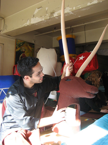
I was asked to draw up potential costume designs for a “Jagermeister Monk/Angel” at my day job at the costume/puppet shop. I was very excited to contribute to the mythology of the number one choice of drink of frat creeps and date rapists. Hey, I get it… it’s sweet and tasty and served cold. Yay. It’s like licorice but worse. You drink it when you have nothing else left, but even then…

deer
Anyway, the folks at Jagermeister Headquarters green lit my design and off we went! I built the elk head interior and the other studio hands draped it. We had to do four of them total and we did them in record time (a week). We also did cloaks, paddles…

Categories
Art & Illustration Comics I Make

CTHULHU TALES #7

Just in time for Halloween, Cthulhu Tales #7 (from Boom! Studios) hit the comic book shelves yesterday and look… I drew the cover!! Below, my initial image.

I bought the comic at my local comic shop and read it. You should, too. This isn’t shameless self-promotion, I promise. You will want to own this comic. I am actually honored that my cover graced the 2 horrific stories inside. I’m not even being sarcastic, despite what my close friends may think. You gotta see it to believe it.

Categories
Art & Illustration

TEXAS FRIDAY!

I was going through some old files of mine the other day and came across a couple of drawings, each on one side of the same paper. I think they were scribbled on the nearest sheet in an inspired post-movie frenzy. I had seen “Friday the 13th part V” and “Texas Chainsaw Massacre”… in a row. My parents were asleep. I was six years old.

How did I have a concept of neck holes back then??