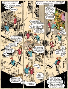
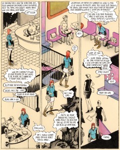
With Zegas #2 out from the printer and into the world, I wanted to take a closer look at the super panel breakdown, which I use all throughout the issue.
You’ll recognize the trick, it’s simply one larger image broken down into pieces OR one larger image with characters moving within it . I wanted to take advantage of a double page spread to choreograph Emily Zegas’ body language through her several moods and locales. The tricky part was making sure the eye was led exactly where it should go. Turns out the heavy lifting is done by the words, the conversations, the thought balloons. The flow goes down the panel , then up the next, then back down, etc.
You can call these my “Marcos Martin” pages. I won’t deny it, he’s been an influence for a while and I’m sure sequences like this were around at the time I was originally cooking my pages up:
Marcos has made a career of leaving his peers in the dust. He doesn’t toy with a layout, he commands it, and no one in contemporary adventure comics comes close to achieving what he achieves on a regular basis. The scene up there is just one big room in one panel, also used in a double page spread. We follow Spider-Man, our eyes being led to the right then back to the left, punctuated by inset panels.
THERE’S A TIME AND A PLACE
Another main influence on this approach is Chris Ware, another storytelling master who occasionally uses the panels to reflect different seasons, eras, or time signatures. This Big Tex page does it all.
It’s no secret that Ware had been influenced by Richard McGuire and his seminal story “Here”, from 1989…
… but the real godfather of the page-as-map is Frank King and his Gasoline Alley strip.
GUTTERS
Going over the overblown staging in these pages reminds me of the smaller examples, the panels that are broken into fragments in order to delay time, build tension, or reveal story details. In We3, Frank Quitely took a Grant Morrison story and took it into visually innovative territory. This modest sequence, however, is nicely paced.
Was it a callback to Harvey Kurtzman, that scene? I’d like to think so. Kurtzman was a true virtuoso of all of these narrative tics and bumps, his war comics being prime vehicles for strong and smart material. These three panels are works of beauty, captions be damned.
This batch, courtesy of Jim Steranko, works well enough but isn’t quite necessary. The image’s story does progress, and the gutter breaks do make the eye start and stop. Steranko was more than capable of managing subtlety, and this scene certainly tries to build up a sense of weight, but it still feels like a faint attempt.
Same here (Steranko again). As if mid-air speech wasn’t hard enough to swallow, the gutter breaks seem to be used as mere window dressing. Maybe it was to show that more… panels had been drawn? Steranko, after all, was once nearly denied payment for writing a silent page. Either way, the balance of dialogue and movement can make or break a moment; this one’s a dud.
Just one more dud. Actually, the panel break would’ve been useful if the image actually revealed something, maybe the very thing that’s being explained. I gotta admit, this is a pretty funny out of context scene, but that may have something to do with those tears. Deluxe Format tears.
Here’s a pretty simple but effective Frank Miller shot…
… and here’s another one that justifies the breakdown treatment in a different way. The gutters stagger the eyes one panel at a time while the monologue unravels at its own pace. It’s confident work, and in Miller’s pre-Sin City comics, this type of rhythm is dominant.
Oh, and punchlines. They’re good reasons to break up a panel. Julie Doucet knows the score.
BRING IT HOME
Back to the page as a setting, Gianni De Luca did some incredible, jaw dropping sequences in his time. As far as I can tell, his work was serialized in Il Giornalino. This il Commissario SPADA page is from 1979…
… but his most revered work continues to be his adaptation of Hamlet. Here’s a two page spread from Amleto, from 1976 (the entire story is made up of double page spreads, with a usual change in location per page turn). Click on it and bask in its glory.
I can’t help but think of this John Romita Jr. two pager, perhaps his most imaginative and ambitious sequence yet… and it’s only a walking figure. Such simplicity!
So there you go, a few drops of inspiration on how to stretch and maximize the real estate within an image, a panel, or a page or two. I’m not sure whether the reader should be made aware of such mechanisms, but some of these pages are too bombastic to ignore or be taken passively.
Click away:
Buy Zegas #2 online or directly from me this upcoming weekend, in case you find yourself in Portland’s own comic-fest Stumptown!
–Fiffe
UPDATE: Criminally Left Out
Thanks to Marc Sobel for reminding me of this great scene by Jaime Hernandez.
I don’t recall Jaime using this method very often but when he does, it is spot on (from Love & Rockets #29, “Flies on the Ceiling“, 1989). Calling him a master storyteller isn’t enough, so let’s just agree that the guy’s a genius. Thanks for the reminder, Marc!


